Tax Office Makeover – behind the brand transformation
More than just a Tax Office Makeover
A new office look and professional brand doesn’t just stop at a logo update, a few color swatches of paint, and new furniture. Our Tax Office Makeover was a complete brand overhaul, from the business card, to the website, social media site, photography, signage and posters in the store and all the strategic messaging that goes with it. This required long hours from a dedicated, small crew on a budget.
Final episode of the Tax Office Makeover
Brand Transformation
The transformation of the Guardian Tax brand was a process that started by discovering Office Makeover winner Karyn Chapman's vision, mission and values for Guardian Tax. We needed to understand the story behind Guardian Tax, and then we worked through the process of creating a brand identity consistent with who Guardian Tax is now and aspires to be in the future.

Finding the right partner
With a short amount of time to complete the office makeover and a limited budget, we decided to partner with marketing agency Grafico Marketing Group. Their experience in branding, retail design, digital and more helped make this project a success.
Logomark design options created
The team at Grafico Marketing Group started the design process anchoring Guardian's identity around a visual logomark that illustrates the Guardian name.



During the design process Grafico explored complementary fonts and colors, drawing inspiration from colors used in the Guardian Tax office and website.
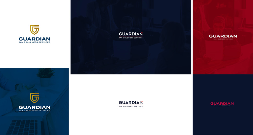
After completing the design process a final logo, font type and color palette was complete. The shield illustrates protection and security provided by Guardian Tax, and a "G" for Guardian is integrated into the shield.

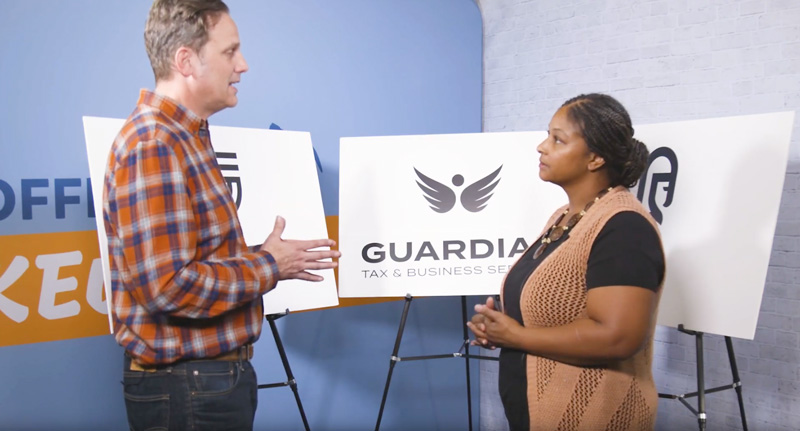
Santa Barbara Tax Product Group's own marketing expert and Office Makeover host Jan Buncher explains important elements for a great logo design.
See the strategy behind the logo design elements.
Office Transformation
After completing the design process a final logo was complete. With a "G" for Guardian integrated into the shield. The shield illustrates protection and security provided by Guardian Tax.
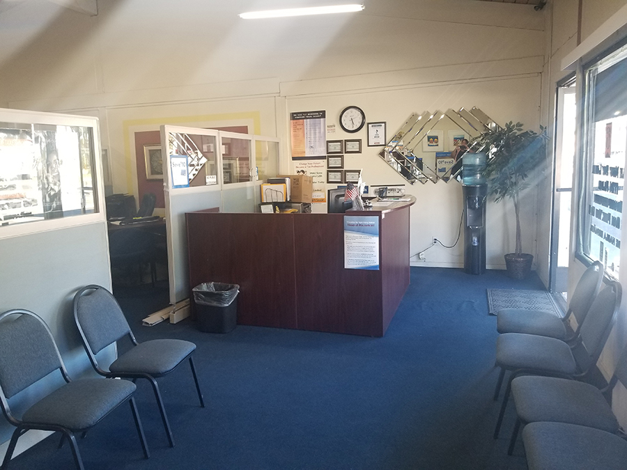
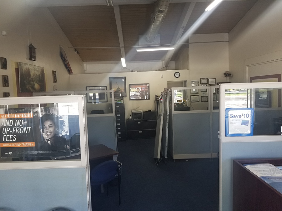
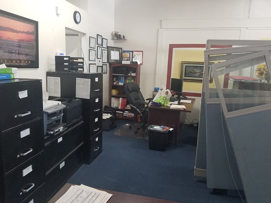
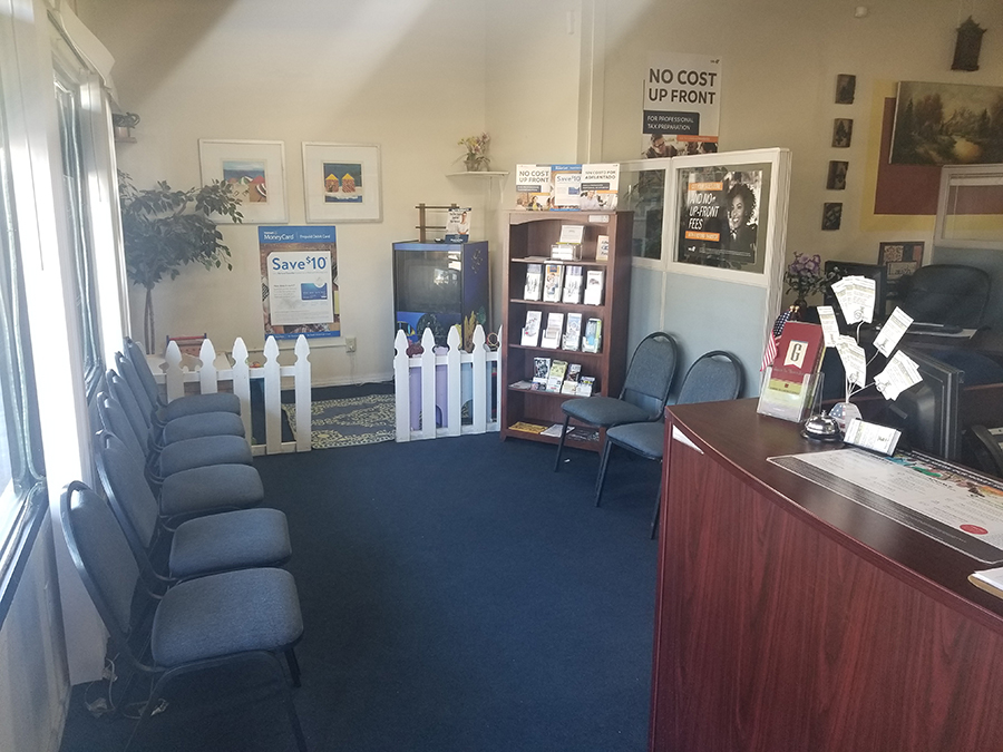
Photos of Guardian Tax before the office makeover.
Complete interior redesign
The team at Grafico Marketing Group leveraged years of retail design experience to create an office interior design that is inviting, professional and within budget! From creative paint treatments that integrate the brand pattern into the office interior to lighting that accentuates existing office features, the Grafico team implemented affordable, sophisticated solutions.
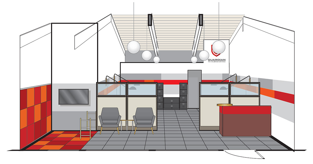
Office furniture, lighting and paint treatments carry the new Guardian brand identity throughout the office.
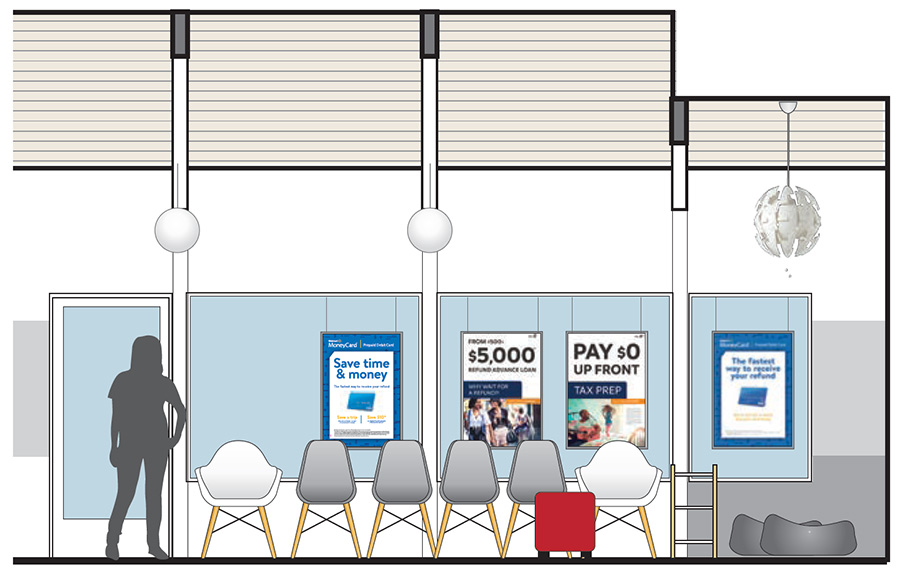
Varied seating creates visual interest. Guardian's large windows are a great asset. Large posters with uncluttered windows attracts consumers' eyes to key messages.
Office furniture and paint treatments carry the new Guardian brand identity throughout the office.
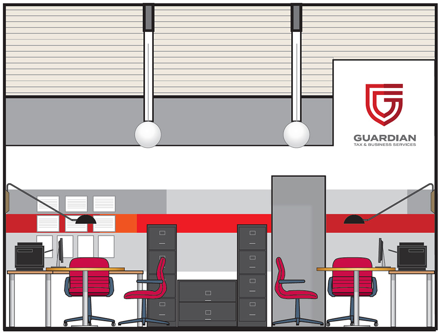
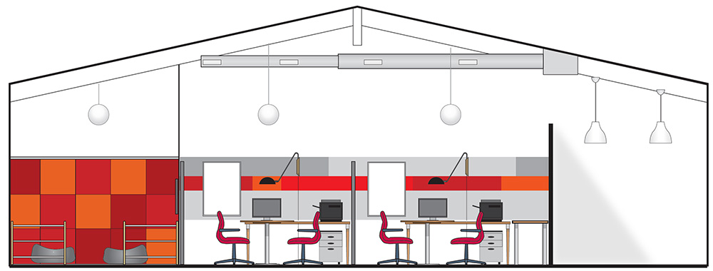
Globe lighting provides warm light that projects up to highlight the architectural ceiling and down to light the office.
Use color to define space
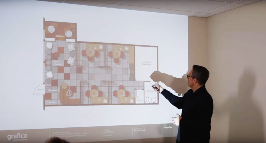
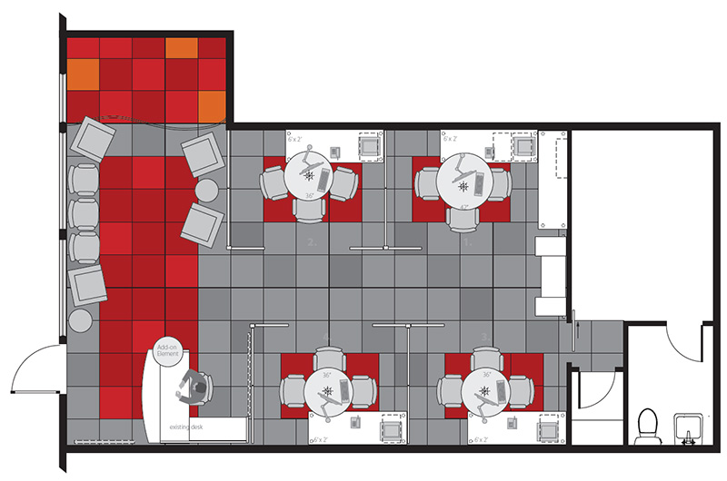
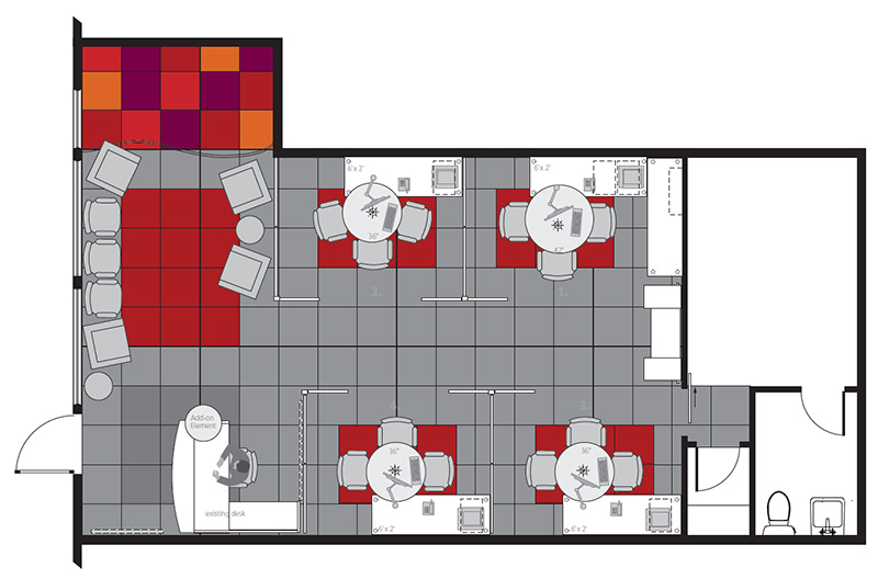
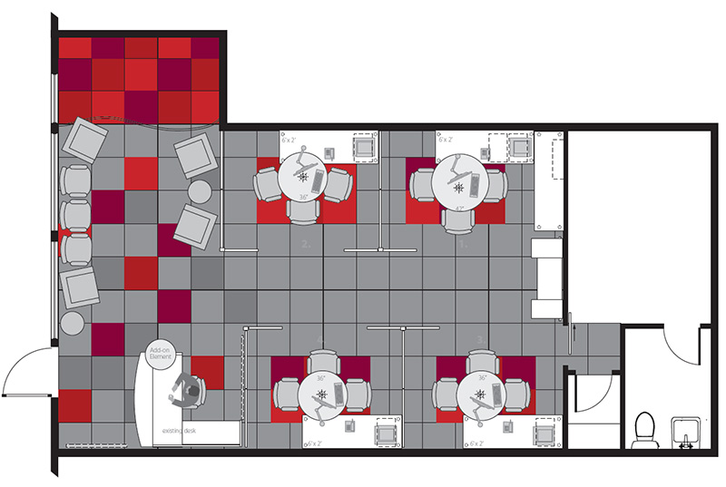
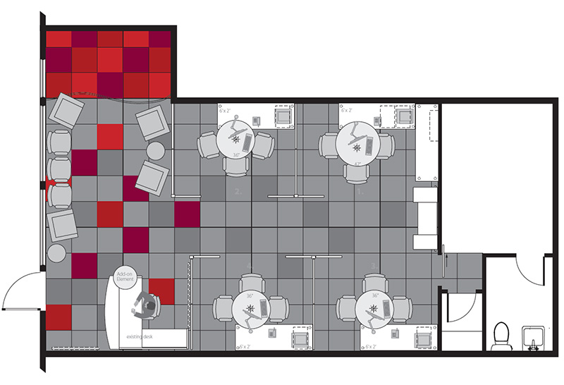
The floorplan followed Guardian's original floorplan but color tiles were proposed to create visual footprints for the waiting room, kids area and office workstations. Grafico was careful to tie everything in to Guardian Tax's new color palette.
Click here to read about how we had to be flexible with design changes to accommodate unplanned expenses.
Grafico's Chief Creative Officer Lou Costantini walks his design team through the office interior and exterior transformation.
See what he recommends to improve the office experience
Digital Transformation
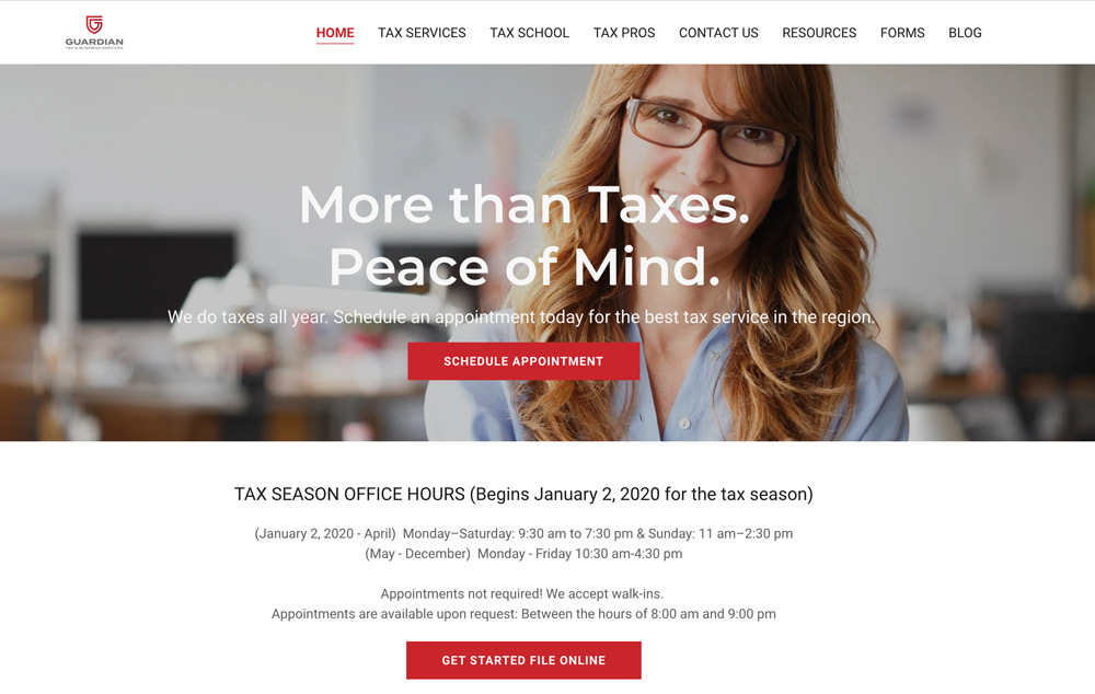
The Guardian Tax website was completely redesigned and search engine optimized.
Complete website redesign
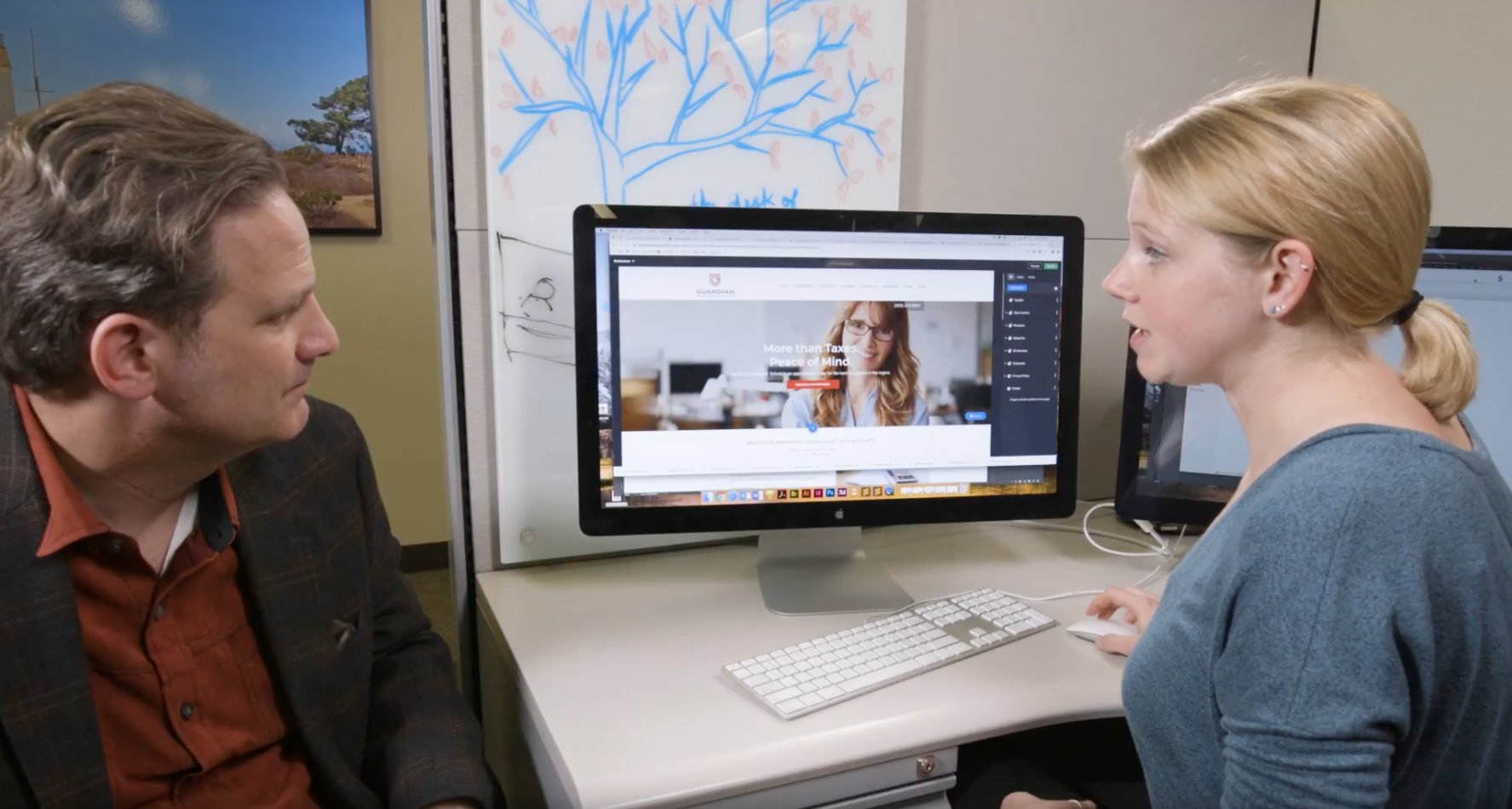
Once the brand identity for Guardian Tax was complete, the website was updated with a modern website design. The new design wasn't just about appearance, but clearly communicating what sets Guardian Tax apart from competitors.
Santa Barbara Tax Products Group designer McKenzie Records explains what she did to streamline website navigation, organize content, and give key pages a Call to Action to help Guardian Tax drive more taxpayers to her office.
Watch and learn how you can improve your own website.

Original social media content including client testimonials give Guardian Tax a professional, human face.
Updated social media content
Guardian Tax's brand and "Real" campaign extended into their social media channel with branded social media content that reinforced the Guardian Tax identity and unique selling proposition of service, education and people. Client photos and testimonies provided authentic, relatable content.
Get free social media content
Looking for professionally produced social media images and content you can post? Enroll with TPG and get free content.

Collateral and Printed Materials
As you have seen from the office and digital redesign, the brand identity including logo, font and color palette are woven across all channels and mediums. This also extends to the brand identity package we gave Guardian Tax to make sure print materials are integrated with her storefront and digital footprint.



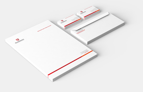
The corporate identity redesign included stationary, envelopes, business cards, etc. with brand colors, identity and font integrated throughout.
Download free templates
Enroll with sbtpg and download free templates including business cards, letterhead, and more. Multiple color options lets you make the brand your own.
Personalized Campaign
To help a small business compete with a big business, every impression has to be as good and consistent as the first. Which is why, we shot original photography and video of Guardian’s clients, capturing their real, unscripted testimony to tell Guardian’s story, showcased on Guardian’s walls, website, and social media. It was our passion and commitment to make Guardian’s brand every bit as complete as our own.
“We shot original photography and video of Guardian’s clients, capturing their real, unscripted testimony to tell Guardian’s story, showcased on Guardian’s walls, website, and social media.”




To compete with big business, every impression — from the visuals to the strategic messaging that goes with it — has to be as good and consistent as the first.
How has this helped Guardian Tax?
Update from 1 year later
We asked Guardian Tax owner Karyn Chapman
to share what business has been like since
winning the Tax Office Makeover.

Things don't always go as planned. See a few of the surprises we encountered during the makeover.
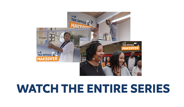
Watch the entire Tax Office Makeover series for tips on how you can transform your own tax practice.

